Redesigning Panoptica Onboarding
To address significant drop-off in the onboarding process of Panoptica, we launched a comprehensive research and redesign initiative to identify key friction points and opportunities for improvement.
Organization: Cisco Role: Design Leader
Despite its cutting-edge capabilities, the initial user onboarding and empty state experiences of Panoptica presented significant challenges. Users often reported feeling overwhelmed during onboarding and confused when encountering empty states, which slowed down their ability to effectively utilize the platform. These initial interaction points are crucial as they set the tone for user engagement and long-term satisfaction.
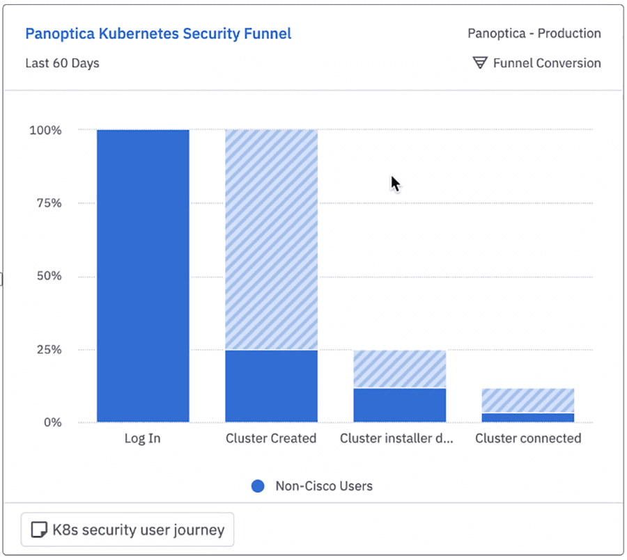
Product analytics showed that less than 8% of customers who signed up would connect a cluster, a necessary part of using Panoptica. Users would essentially drop out of the product before interacting with it at all.
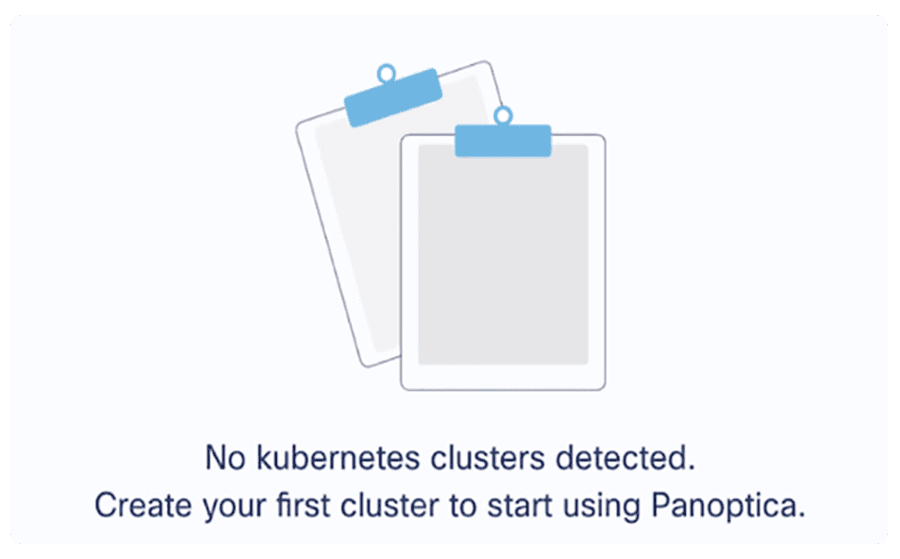
Additionally, empty states were overlooked and lacked any information to help the user understand the value of the product’s key features.
Process
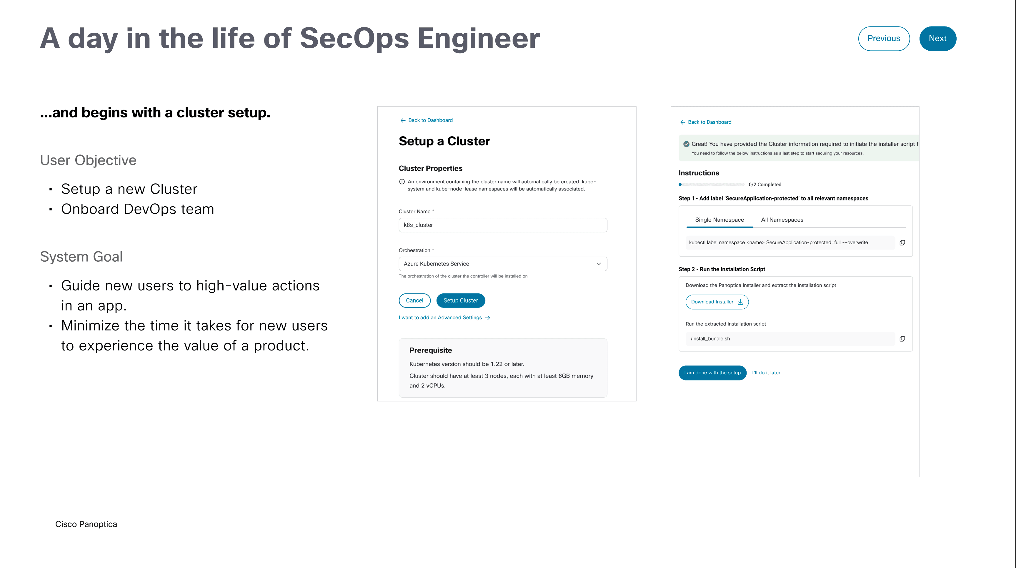
Our goal for revamping the onboarding experience was to create a seamless, intuitive, and engaging first interaction for users.
In response we developed guided walkthroughs, interactive tutorials, and contextually aware help tips to enhance user understanding and reduce the learning curve.
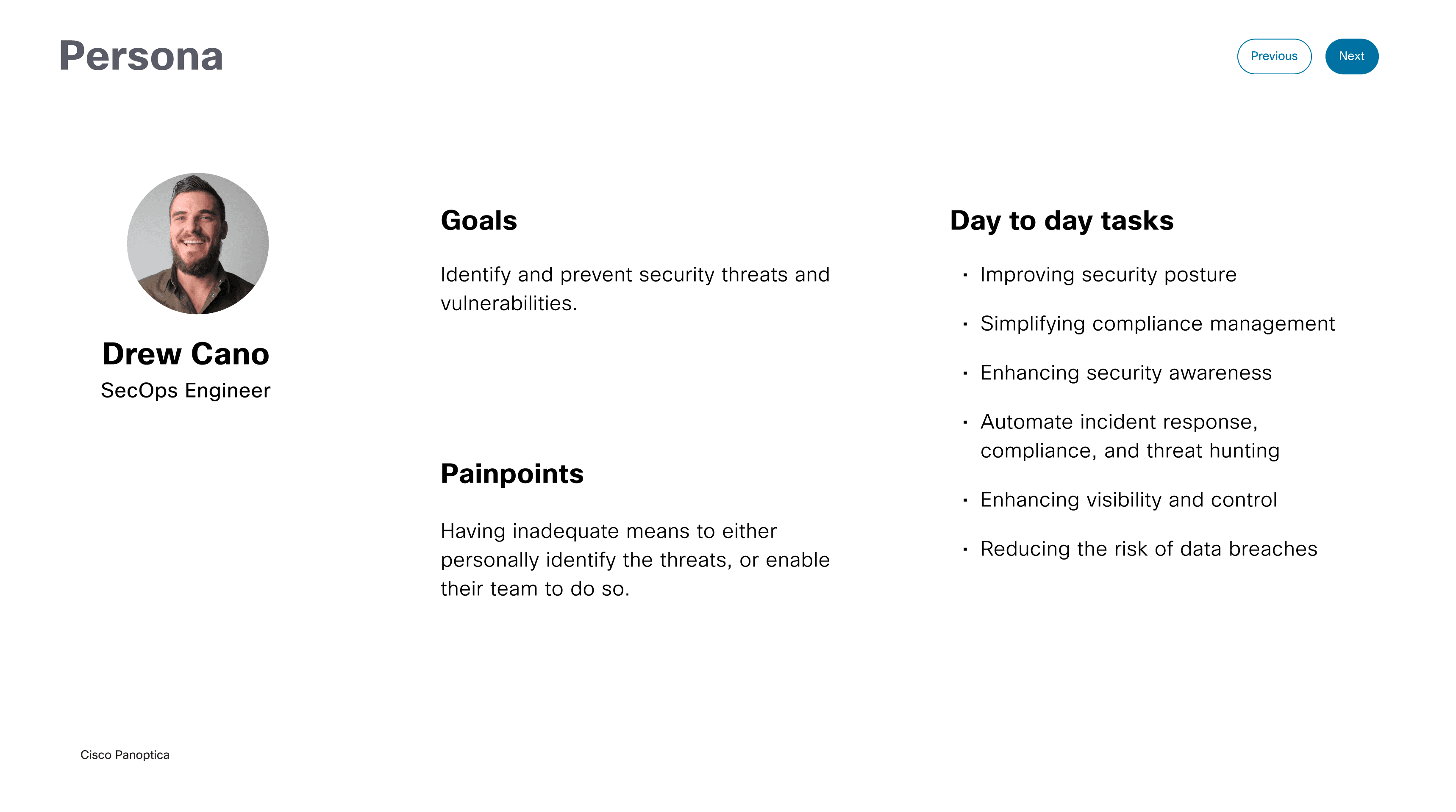
Through user research we identified several reasons for the significant drop-off. They included the following insights:
- Not sure what to do next
- Not the user responsible with the right information
- Not sure it’s worth the time
Outcome
A comprehensive plan to improve the cluster connection process was initiated, which included:
- Define the tasks for the job performer and the techniques for doing so
- Show the personas’ main features relevant to automation to reduce time to value
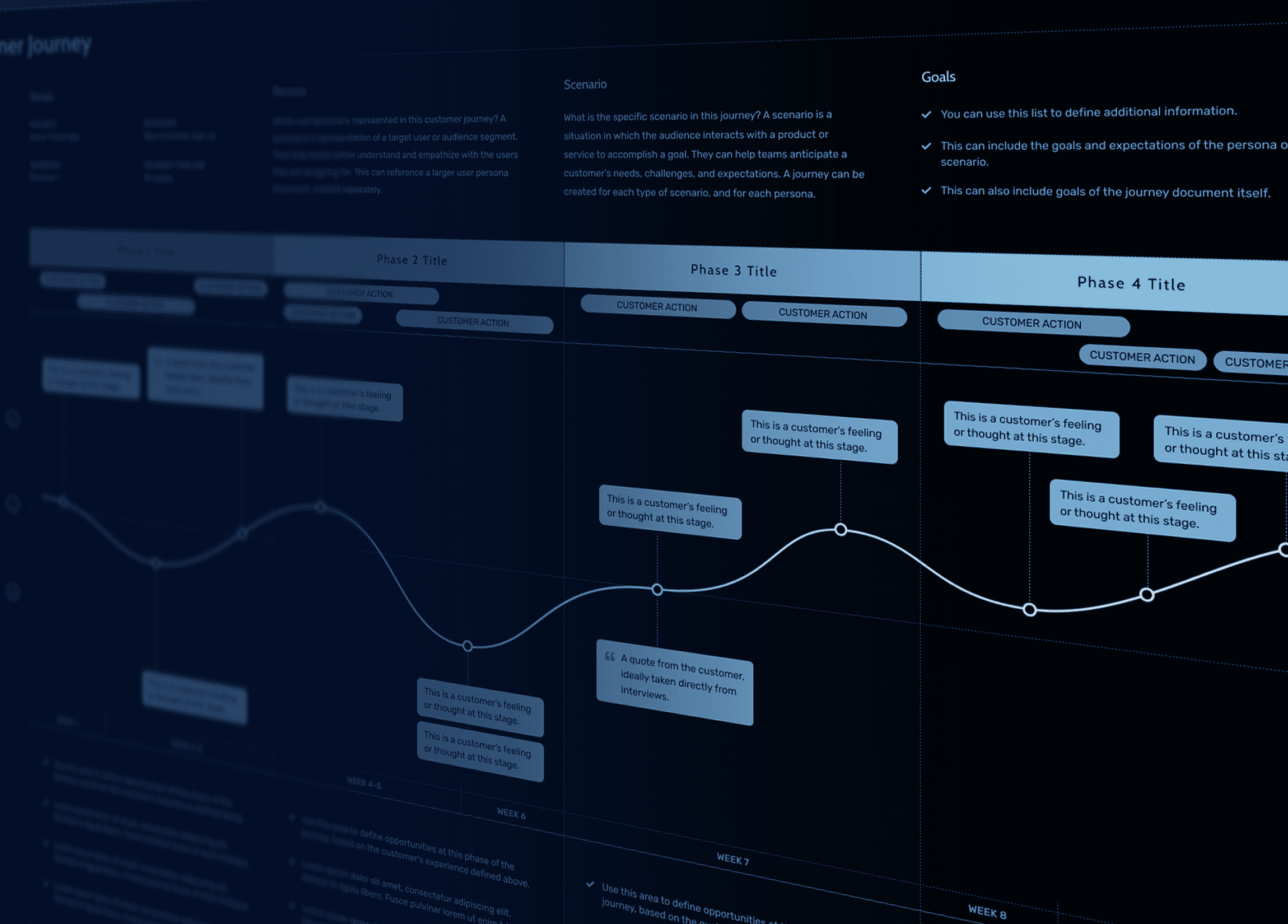
By using the information provided on Day-0, the user should get familiar with the product and be motivated to take the appropriate actions to integrate Panoptica.
Transformative enhancements to Panoptica onboarding and empty state areas elevate the first-time user experience by demonstrating immediate feature value and maximizing the efficiency of cluster connections.
In addition, we created a content plan to maximize the empty state areas to illustrate more informative and action-oriented opportunities.
Instead of showing blank spaces, the new designs included helpful suggestions, examples, and clear calls-to-action that guide users on the value they will derive when they take the time to engage with the platform.