The Missing Middle: Buttons, Bots, and the Future of Interfaces
Every few months I hear the same argument about the fate of the user interface. There’s always one side that’s sure chat is about to swallow every app we use. And another side that’s just as sure that people will always reach for buttons.
Me and my team build agentic products, so we more or less live inside this argument, and I have come to think both sides are wrong in the same way. They are fighting over the two ends of a spectrum and skipping the part in between, which is where almost everything we actually do all day lives.
On one side, you force an agent onto a simple, familiar task and it narrates every step, asks you to confirm twice, and takes longer than the couple of clicks that would have just done it. On the other, you make someone grind through a maze of menus and buttons for an outcome an agent could have brute-forced for them. Both are the same mistake from opposite directions.
So this write-up is an attempt to explain the whole UI spectrum, and I’ve tried to make it interactive, so you can poke at a few examples and feel where one approach might give way to the next.
Why “kill the interface” keeps failing
There’s a whole graveyard of products that tried to kill the screen. Humane raised around $230 million for a wearable pin meant to replace your phone, and within a couple of years its remains were sold to HP for a fraction of that. It’s the same pattern every time: when a tap-based interface already does a job well, pushing that same job through speech or chat tends to add steps and subtract certainty.
When a capability has to be wedged into the corner of every app you open, or installed as a dedicated key on your keyboard, someone is working too hard to create a habit that is not forming on its own.
When an interface already nails a task, wrapping it in a chatbot rarely makes it better, and most times makes it slower.
But something real is shifting
Obviously, agents aren’t a dead end, they’re winning easily at one end of the spectrum.
Just look at how the tools built for engineers have quietly been leaking into everyone else’s hands. People who have never written a line of code are now pointing agents at messy, open-ended jobs: cleaning up a pile of files, stitching together a workflow, pulling a year of receipts out of an inbox and sorting them. Nobody had to sell them on it, they reached for it because it took the busywork off their hands.
I know for me, the moment a task is fiddly, repetitive, or buried five menus deep, I’d rather describe the outcome and hand it off to an agent than learn another interface and do it by hand.
So which is it? Are buttons winning, or are agents winning?
Both, duh, but the whole thing is more clear when we stop sorting interfaces into two camps and start treating them as points along a range.
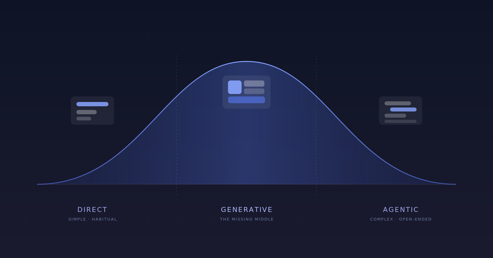
The big thinking mostly lives in the middle
I get it, it’s tempting to draw a straight line from simple to complex with a tidy handoff somewhere in the middle. But the real shape bulges in the middle. The truly simple tasks (pausing a song, snapping a photo) and the genuinely heavy ones (analysis across a giant dataset) are the thin tails. The bulk sits in between: comparing options, planning something, drafting a document, booking a trip that does not fit a standard form.
This is easier to feel than to describe, so here’s the spectrum to play with, and that squishy middle is hard to miss.
Booking a multi-city trip with loose dates
A familiar shell, with the hard part rendered on the spot to fit the request.
The thing that made graphical interfaces work in the first place is that the options are visible. You are not asked to recall a command. You can see what is available and act on it directly, moving the thing you mean instead of describing it. That model holds beautifully right up until the number of things you can do outgrows the room to show them. Then the overflow has to go somewhere, and it gets tucked away one layer at a time:
That stack is the difference between a story editor a kid can pick up in a minute and a complex financial platform that takes years to learn. They both run on direct manipulation; the second one just has far more crammed into the same model. Past a certain density the interface stops helping and starts hiding, which is the whole problem with expert tools: the power is real, but it is locked behind menus most people never get through. The opening there isn’t to replace that power with a chatbox, it’s to make it reachable for far more people than ever learned the interface.
The missing middle: situated interfaces
So what fills that squishy middle? Generative UI is the mechanism. What it produces is an interface assembled to fit the moment rather than drawn in advance for the average case. I’ve started calling it situated UI. Early versions already show up in the wild, just ask a capable model to explain an idea and it can hand back a small interactive thing to play with instead of a wall of text. It helps to think about this in three levels.
A generated component
One piece of the screen is built on the fly and styled to match the brand. Useful, but bounded to a single slot.
A stable shell, generative regions
You keep a familiar interface, but parts of it adapt to the request. The hard region is assembled, not drawn screen by screen.
The rules are the product
The whole experience is a situated interface. There are no fixed screens, just the rules that decide what to show.
Let’s just focus on level 2, because it keeps everything direct manipulation is good at and only regenerates the part the standard layout handles badly.
We’ll use the typical flight search example, the normal form is great for the common trip. But the second the trip gets unusual (more than one origin, an intentional stopover, dates you have not pinned down) that neat grid is the wrong instrument. Keep the shell people know, and let the result underneath be assembled to fit the request.
Same shell, different generated region. The designer's job moves from drawing each screen to defining the blocks and the rules for assembling them.
Each request in the demo produced a different layout: ask for the cheapest dates and you get a price chart, add a stopover and you get a route, leave it open and you get a set of cards. Nobody drew those three. Each one is a situated interface, built for that request and nothing else.
Look at what that does to the design work. When the result is generated, you stop hand-placing every element on every screen and start defining the pieces and the rules: here is the kit, and here is when a map beats a list or a slider beats a grid. This is the same shift I wrote about in Designing for States, Not Screens. You shouldn’t be designing screens when the real job is designing the system that produces them.
Keeping the generated middle trustworthy
My team and I have been seeing a real (but addressable) hazard here. In the flight example, that region redrew just once, to fit a single request. In a real session it keeps redrawing as you and the agent go back and forth, and the trickiest version is a change to something you’d already settled. A silent re-render leaves you guessing: did it understand, did it quietly touch anything else, where do I stand now?
This hazard is exactly why we built the HAX principles at Outshift, and why we keep refining them. They’re not meant to be abstract, they’re the line between a generated interface people trust and one they quietly abandon.
Control
Every action the system takes needs a clear way to stop, cancel, or edit it. People should steer, not spectate.
Clarity
Replace vague "thinking..." with a real signal of what is happening and why. Context is what builds confidence.
Recovery
Let people roll back, retry, or tweak without losing their place. Treat undo as part of the flow, not a footnote.
Collaboration
Treat the agent as a partner. Ask clarifying questions, show reasoning, invite input. It is a dialogue, not a command line.
Traceability
Make it possible to see what data, tools, and steps produced a result. Transparency is how a system earns trust.
You can see some of this play out when you ask the planner below to change a plan you already have: it tells you what it understood, shows exactly what moved, and leaves you a way back.
A change you asked for comes back as a confirmation, not a surprise.
Where I land
For me, it’s all pretty clear. Direct manipulation keeps the simple, habitual tasks, where it has always been faster than talking, and agents take the work that’s complex or tedious and no one should be doing it by hand. The hard part, the part nobody has really nailed yet, is the enormous space between: the middle, where situated interfaces assemble themselves from a designed kit and a clear set of rules while staying steerable through every state.
That middle is where my own work keeps pointing. AI Lens came out of asking how context could be summoned in place instead of hunted for in menus. YourAgent.Network is me working out what a team’s interface becomes when everyone has an agent of their own working alongside them. Different surfaces, one throughline: design the system that produces the experience, not the screens. And as agents take on more, that system reaches past the interface into how they reason, remember, and explain themselves, which is why we keep evolving our HAX framework, so people stay in control as the cognition underneath gets more capable.
Working this middle out, knowing task by task when to hand someone a button, when to let an agent off the leash, and when to build the interface on the spot, is the hardest part of the work right now, and easily the most interesting.